
Can this simple metric prove vaccine danger?
Years of Life Lost per death is already well understood, and turning it into a percentage (Percent Years of Life Lost) can provide additional insight into COVID19 vaccine safety

Summary
A group of authors published a “trilogy” of papers which calculated Years of Life Lost (YLL) and Years of Life Lost per death (YLL per death) for three distinct time periods. Two of the time periods overlapped heavily with Year 1 (2020) and Year 2 (2021) of the pandemic.
Their data clearly shows that Years-of-life lost per death increased substantially from 2020 to 2021
Since the papers do not classify deaths by vaccination status, we cannot directly infer much from this trilogy. But the YLL-per-death metric points to a new and perhaps better metric for calculating vaccine danger.
Instead of using expected age of death based on actuarial calculations, we can simplify things by using 100 as the target life expectancy and calculate a new metric called Percentage of Years of Life Lost (PYLL) per death
PYLL-per-death could help avoid some big confounders we usually see in COVID19 vaccine mortality analysis. This can also simplify calculations for independent researchers and analysts, who don’t have to procure actuarial datasets if they use this metric.
Someone was trolling John Beaudoin on Twitter recently and then shared a paper to definitively “prove” his point.

It turned out to be an amazingly useful study, but probably not in the way the authors intended, and almost certainly not in the way the troll wanted.
Thank you troll!

To summarize:
authors studied Total Years of Life Lost (YLL) and YLL-per-death based on previous actuarial data
They did the same study for three time periods, two of which overlapped quite a bit with year 1 (2020) and year 2 (2021) of the pandemic
They found an increase in the YLL-per-death from 9.2 in Y1 to 10.8 for Y1+Y2. This represents a drastic 17% increase from the first to the second period, and is made much worse by the fact that the people who died in Y1 are also included in the second number, meaning the number for Y2 alone will be much worse.
I downloaded the datasets provided in the papers and show that the YLL-per-death number for 2021 is actually 12.14, which represents a 32% increase over 2020!
A while back I wrote an article talking about Mean Expected Years of Life Lost (MEYLL) as a better metric for evaluating vaccine safety, simply because it is more fine grained.
I think other metrics are or can become heavily confounded.

As you can see, the YLL-per-death is based on the same idea. I did not know it had already been studied, but as I will show later, this type of analysis does not seem to be common knowledge in the COVID19 literature.
Did the study gain traction?
What I really appreciate about this example is that the same authors wrote three papers on the same exact topic, and we can compare their reach to see how much traction each paper got. This automatically eliminates any possibility of confounders such as how famous the authors already were in their fields etc.
The first paper was published in Sep 2020 and covered the time period between Feb to July 2020.
It has an Altmetric score of 294 and is in the top 5% of all research outputs scored by Altmetric.

The second one was published in Apr 2021 and covered the time period between Feb 2020 and Jan 2021.
It has an Altmetrics score of 121 and is also in the top 5% of research output scored by them.

The third (and most recent one) was published in May 2022 and covered the time period between Feb 2020 and Feb 2022.
It has a very low Altmetric score and is not anywhere near the top 5%.

Even though it has been out for more than a year, obviously the third paper is much newer. And people all over the world also want to move on from this discussion, but that is still a fairly precipitous drop!
In any case, whatever the reason, it is quite clear that the study did not gain much traction.
How many studies of “life lost”?
There is a search engine dedicated to COVID19 research papers called LitCovid which curates only published papers (no preprints), and only allows papers it deems high quality1.
The LitCOVID website has only 144 studies of “life lost” and only 33 of them are in the context of the vaccine. In fact, even the second group of papers which mention the word vaccine are not usually discussing this metric in the context of evaluating vaccine safety.
There are over 3 million publications on LitCOVID as of August 2023, so I think it is fair to say that the “life lost” papers are a very small fraction of the total COVID19 research literature and that this topic has not been well-studied.
Results from the paper
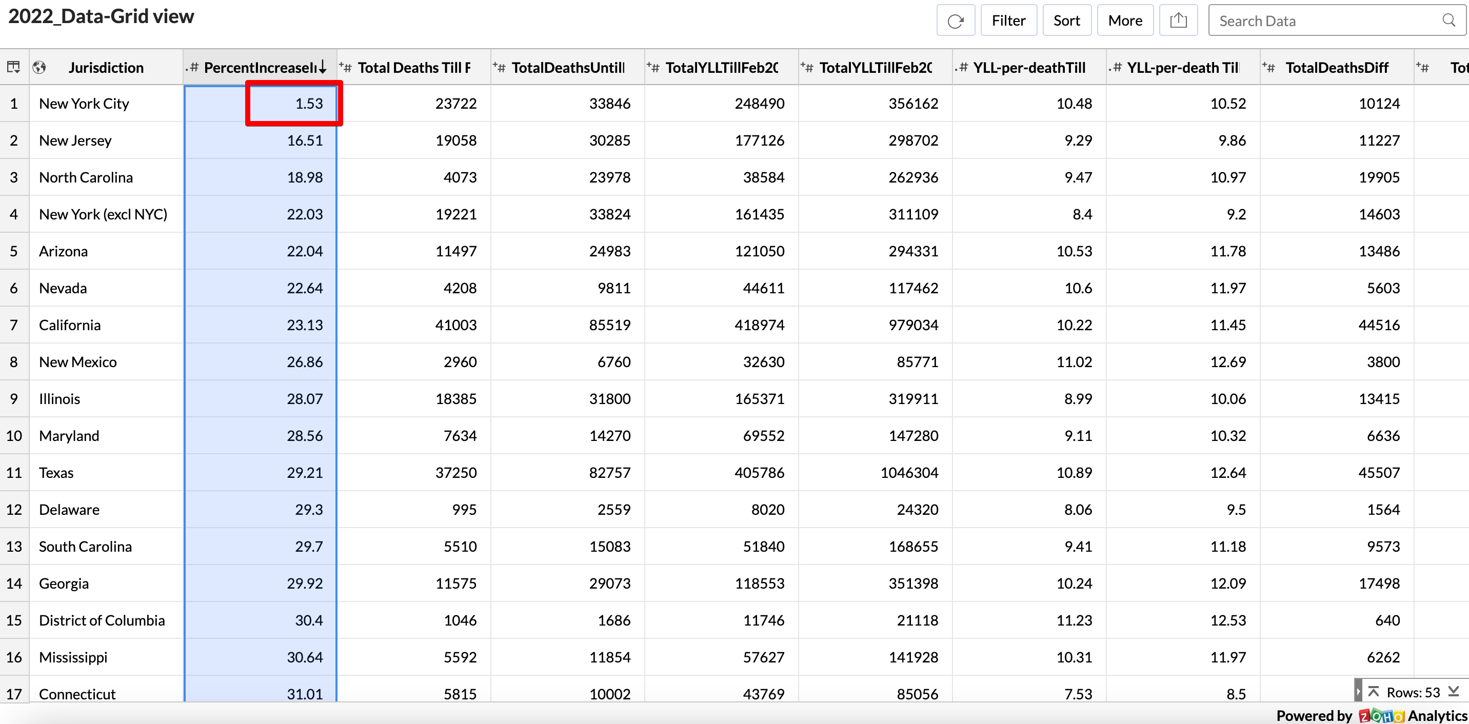
The papers provided the YLL data for the respective time periods that they studied (Period 1, Period 2), and I copied and pasted them into a spreadsheet.
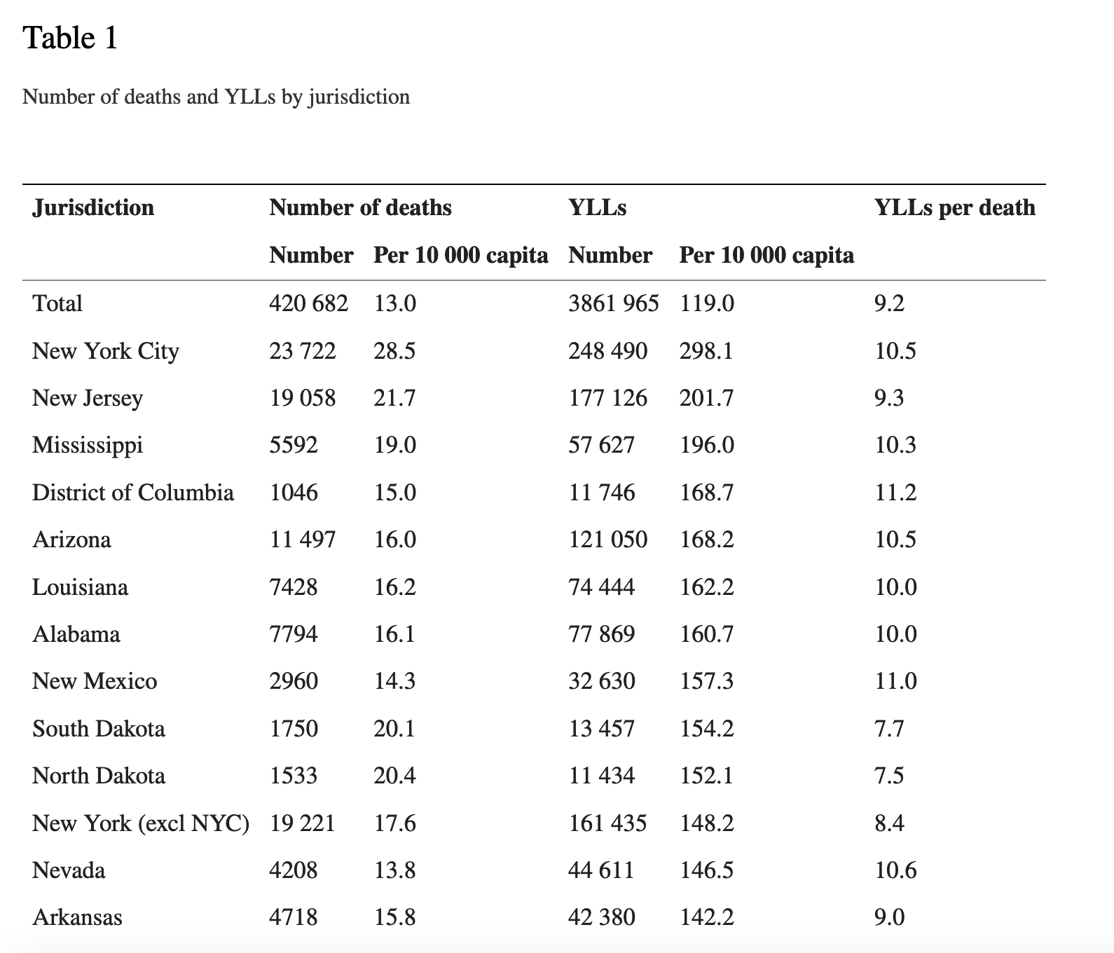
The authors did not provide the numbers for just the 2nd time period alone2.
So I calculated the difference in the number of deaths, and the difference in YLL and then calculated the YLL-per-death for the second time period alone. Notice that the totals for the 2nd time period can be derived by simply subtracting the totals for (Y1+Y2)-totals for (Y1).
Then I calculated the percentage increase of the YLL-per-death from 2020 to 2021 (second column).
It shows an increase of YLL-per-death from 2020 to 2021 across the board.
In aggregate, the USA on the whole had a 32% increase in YLL-per-death from 2020 to 2021.
Seven states had a 50%+ increase, with Hawaii barely missing the cut at 49.14%

The one outlier on the lower end of this spectrum is the city of New York, and its data is so different I am now wondering if there is some kind of mistake in the paper.
This does not definitively prove vaccine danger (for e.g. we don’t know the vaccination status of those who died).
But we can say with a lot of certainty that the sum-total of any pandemic health policy should be to make sure that there are no such drastic increases in the YLL-per-death numbers due to the policy itself.
In addition, I think the YLL-per-death metric is not a very simple one, because the number of years of life lost is calculated based on actuarial tables etc.
One way we can improve this is to subtract the age of death from a predefined constant number.
Percent Years of Life Lost (PYLL) per death
So let us go one step further and instead of using a baseline age-of-death based on actuarial calculations, we can just set 100 as a target.
That is, we take the person’s age at death and subtract it from 100, and let us call this metric PYLL.
It has some benefits over YLL:
it is a universal number, and independent of actuarial analysis which may or may not be available and may or may not be easily accessible
it is a constant and will help set baselines independent of the current era, helping us see trends over much longer timespans
since we are simply subtracting from 100, the number also has an implicit and intuitive meaning
Suppose we construct four cohorts:
1) Cohort 1: Deaths in 2019 as the baseline (and sanity check)
2) Cohort 2: Deaths in 2020
3) Cohort 3: Deaths in 2021 for those who took zero doses of the vaccine
4) Cohort 4: Deaths in 2021 for those who took one or more doses of the vaccine
We can “guesstimate”, based on the YLL studies, that the PYLL-per-death for Cohort 2 was fairly higher than PYLL-per-death for Cohort 1
We can say with some certainty that a vaccine failed if either of these are true:
a) the PYLL-per-death for Cohort 4 is higher than PYLL-per-death for Cohort 2
b) the PYLL-per-death for Cohort 4 is higher than PYLL-per-death for Cohort 3
My current hypothesis is that both of these happened with the COVID19 vaccines.
Other benefits of using the PYLL-per-death metric
There is now a very confusing aspect of attributing death to the vaccine. If someone dies within a few weeks of their first vaccine dose, the pro-vaccine folks are claiming the death was simply due to contracting COVID193.

It seems a bit outrageous to make such a claim, but apparently the first dose can make you MORE susceptible to getting COVID19, but it is also not expected to provide sufficient protection, so the vaccine gets a free pass if this happens.
Using the PYLL-per-death circumvents this problem.
The vaxxed-but-not-protected person goes into the vaccinated cohort, and they can still be compared with the unvaxxed person’s outcome. That is, even if you accept the above premise at face value, and treat them as if they were unvaxxed, you can still see how they fared compared to someone who had zero doses.
And we also don’t have to worry about how many doses of the vaccine someone took, because these doses are also taken in temporal proximity of at most a few weeks. This difference of weeks is not going to make a dent in something like PYLL-per-death which is measured in years.
Please let me know your feedback and critiques in the comments.
Also, if there is a country which publishes enough fine grained data (preferably in English) so we can do the PYLL-per-death analysis for vaxxed vs unvaxxed cohorts, please let me know in the comments.
The curators are quite biased in favor of the vaccines as you might imagine, but they are not biased against including case reports of vaccine injuries which tells me that they at least keep a somewhat open mind
Was it just another coincidence? Did the authors know the data might make the vaccine look worse?
And it does not help that many of the vaccine adverse reactions are very similar to COVID19 induced health conditions
https://timothywiney.substack.com/p/the-constitutionality-of-the-draft
Very revealing - thanks for your careful analysis.