
v-safe bias: When the first check-in happens AFTER the adverse event
v-safe bias: When the first check-in happens AFTER the adverse event
This is a real bias. But we can use the Vaccine Enthusiast cohort to do our calculations.

Summary:
the correct denominator for v-safe may not be 10 million, because every vaccinee in the US was eligible to enroll, and some of them enrolled only after they had an adverse event
however, there were also many people in v-safe who enrolled before they had an adverse event
we can identify this subset by looking for people who completed the Day 0 Survey and said they were feeling “Good” and did not report any injection site reaction or any of the solicited symptoms
this subset alone is nearly 2.5 million registrants, which is a pretty large subset
let us call this the Vaccine Enthusiast cohort
The Guillain Barre Syndrome Observed vs Expected ratio is over 1 for both Pfizer and Moderna even within this subset
Recently Dr Clare Craig from HART group asked this question on Twitter:
This is obviously a genuine problem.
Someone who only does their first v-safe checkin after they get the adverse event will change the v-safe denominator from 10 million (which is what we have been assuming till date) to a number which is much higher and is a function of how many people were eligible for v-safe.
As it turns out, the v-safe protocol document describes this number quite clearly - everyone in the US who took any COVID19 vaccine and also had a smartphone was eligible. This is nearly the entire US population.

Q1: Does this mean the true denominator of v-safe is over 100 million (total number of people in the US who were vaccinated)?
Q2: Does this mean our previous calculation of O/E ratio is wrong?
To answer Q1, yes, that means the true denominator of the entire v-safe dataset is a much higher number than 10 million.
However, this does not mean our previous calculation is wrong.
But we do need to make a change to the cohort we are considering for analysis.
That is, we consider a subset of the v-safe dataset which avoids this sampling bias.
As you can see, this will reduce both the number of adverse events, and the denominator used for the calculation.
This means our previous calculations for the O/E ratio could still hold.
The Vaccine Enthusiasts cohort
I refer to the people who did a Day Zero check-in (that is, they filled out the survey on the same day1 as their date of vaccination) even though they had no adverse reactions to report, as vaccine enthusiasts.
These would be people who submitted an initial check-in where they reported no pain at the injection site, nor any systemic reaction, and also said they were feeling “Good”.
This is the SQL query for filtering this list:
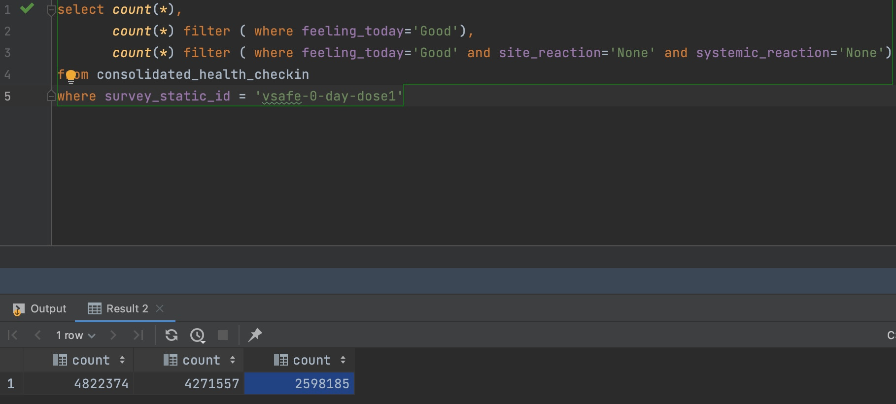
To explain this query:
The survey_static_id is ‘vsafe-0-day-dose1’ (meaning the person filled out a survey within one day of their first dose) for 4.8 million people2.
Of these, 4.2 million wrote that they were feeling ‘Good’ after taking their vaccine.
Of those, 2.6 million wrote that they were feeling ‘Good’, had no site reactions and had no systemic reactions.
In other words, over 25% of v-safe registrants were Vaccine Enthusiasts3.
There are many reasons why it makes sense to focus primarily on the Vaccine Enthusiasts cohort when doing future v-safe calculations:
the obvious one is that it provides a more complete picture (relative to not having the Day Zero checkin for a given registrant)
if someone fills out the initial survey promptly, I would expect that they will be quite diligent when it comes to promptly filling out future surveys also
one of the criticisms of VAERS is that it is all self-reported and that people are just “lying” about their adverse event. If someone writes in to say that they are fine in their first checkin, and then later says they had some adverse event in a future checkin, the odds are much lower that the person is lying about their adverse event
Why public scrutiny helps vaccine safety analysis
As you can see from this example, opening up the data to public scrutiny by non-experts (I am definitely not an expert in medicine or biology) can help approach the same question from multiple angles.
To the best of my knowledge, no one has split v-safe into more-suited and less-suited cohorts for different types of analysis, because no one even got a glimpse of the underlying data until mid-2023.
And this alone should get people to question the rigor and diligence of the medical community’s COVID19 vaccine safety analysis.
To the best of my knowledge, the medical community4 has completely avoided doing any serious analysis of the v-safe dataset, and the v-safe adverse events have been analyzed even less than VAERS!
Recalculating Pfizer and Moderna cohort size
Let us now recalculate the GBS cases for only this cohort.
The query for Pfizer would look like this (note that there are about 1.3 million registrants in this cohort):

The query for Moderna would look like this (note that there are about 1.125 million registrants in this cohort):

So these numbers would be the denominator for our calculations (in the previous article it was about 5 million each).
Observed vs Expected calculation
The background incidence rate of GBS is around 2.035 per 100K person years.
The expected number of GBS cases for a population of 1.3 million over a 42 day risk window is 3 cases.
Even after filtering for pre-existing disease5, we have 10 cases of GBS in the dataset, meaning the O/E ratio is over 3.
The expected number of GBS cases for a population of 1.15 million over a 42 day risk window is also close to 3 cases.
As you can see, after filtering for pre-existing disease, we have 5 cases which still gives us an O/E ratio of over 1.
Conclusion
I will mostly be using only the Vaccine Enthusiast datasets for Pfizer and Moderna for all my future analysis, even though it probably means I am missing out on many genuine vaccine adverse events.
Technically, they started the survey on the same day. It was possible to save the information and submit it later within a 24 hour window. But most of them complete and submit the survey within a few minutes of starting it.
While the consolidated health checkin CSV file has multiple rows per registrant, each registrant can fill out the 0 day checkin for their first dose only once. There are a handful of cases where this is not true (<100 registrants), but that is probably a software bug. In other words, for our purposes, we are correct in assuming that the count also represents unique registrants.
Looking at how keen they were to not blame the vaccine for their injury, I think the percentage of vaccine enthusiasts is much higher. But this number provides a good baseline
And remember, the CDC’s highly cited v-safe paper did not even analyze the free text.
Note that there is a column in the table called VAX_CAUSED_HEALTH_ISSUES which is what the registrant thinks caused their adverse event. However, that could also indicate that the vaccine worsened a pre-existing condition. While that is still a bad outcome for the patient, it will not be an apples-to-apples comparison when doing O/E analysis where we are only looking for new cases.
While I see your reason for calculating the data in this manner and showing that it is still worse than it should be, I feel this is not an accurate reflection of actual v injuries. Recently I have been reviewing in my mind, the amount of people that suddenly died in the last 3 years of heart attacks or rare blood cancer or ? and I have more than expected on my list. It is only in reflection that I realize that these lost family and friends could have been v injured. Who is reporting for them? Since the very real "side effect" of myocarditis has been all but hidden in mainstream communications, how would people, a year later, even know that it could have been? Or rare cancers? The further in time we move away from the date someone got J*bbed, the less likely they are to associate it in their own mind with the V. As we know from Steve Kirsch's work and others, the percentage of MRNA V injury goes UP over time (beyond say 48 hours), not down as would be typical of other (non-MRNA) V injuries. The ACTUAL percentages of V injury may not be known for 10 years, as people develop health issues over time due to the spike protein inflammation.
I was wondering if you noticed in ICAN's dashboard under "health impact" visual they are reporting 751,947 people needed care (Telehealth, urgent care, ER, or hospitalization)?
I am not seeing these descriptors under "health impact"? I'm wondering if ICAN did some custom correlations and created these four summarized descriptors? Do you see them in downloadable data?
Also I was wondering if you concur with my assertion there are actually ~173K child or adolescents dependents under the care of adult? This can be seen filtering on the "relationship" field. ICAN has never acknowledge this fact, nor do they include the "relationship" filter on their dashboard. Thanks.