Why does Austria have an anomalously high number of VAERS reports?
They diligently reported breakthrough infections to VAERS, and created an amazing dataset in the process
If you did not know, the health authorities deleted EU and UK clinical narrative data from the foreign VAERS dataset in November 2022.
The rest of the article uses the clinical narrative data from on the last available copy I got from a fellow VAERS analyst. In other words, by removing this information, the health authorities have made it almost impossible to do the kind of analysis I will be showing you here in this article.
Why are there so many VAERS reports from Austria?
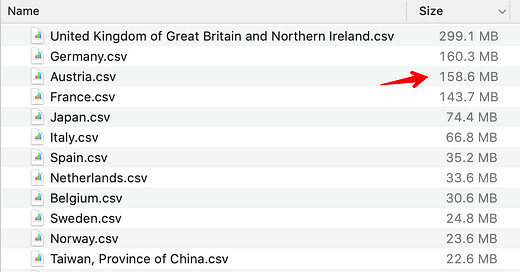
When I created individual datasets for each country based on the foreign data set, the first thing I noticed is how anomalously large Austria’s dataset was with respect to its population.
So I created a chart with number of VAERS reports per capita (reports per million) and verified that it is indeed the highest among European countries.
I was trying to group the reports along different dimensions, and noticed a sharp drop from NUMDAYS = 180 to NUMDAYS = 181 (NUMDAYS is the number of days to symptom onset)
So I started reading the clinical narrative for day 180 to see if I could get some clues. It is usually hard to see patterns in text content, but this one was too obvious to miss. Nearly every report started with the phrase ‘vaccination failure’.
By the way, this is the step which would have been much harder if we don’t have access to the clinical narrative text. In theory, you COULD have found the same thing by looking at the symptoms table. But unless you spend some time reading clinical narratives across many countries this kind of pattern rarely jumps out at you. Go and read some reports online to see how rare it is to have a block of text repeat like that inside the first few words of a VAERS report.
What happens if you ignore vaccination failure?
If you look at all reports which do not contain the phrase “vaccination failure”, the total number of reports falls dramatically, from 103147 to 17304, which is only about 15% of the original number.
In other words, Austria had an anomalously high VAERS report count because they were very diligently tracking breakthrough infections.
Note to readers: If anyone knows why of all the European countries, Austria alone was tracking breakthrough infections so diligently, please leave a comment below.
What we can infer from the breakthrough infections data
Now that we see a clear pattern, let us only consider all the VAERS reports where the word ‘vaccination failure’ is present in the SYMPTOM_TEXT field
If you plot number of reports by NUMDAYS for the range 0 to 300, you get the chart below.
In addition to the sudden drop I mentioned on day 181, the other interesting thing you see here is the sudden increase around Day 7. This sort of indirectly supports the view that many people have - for some reason the COVID19 vaccines makes you immediately susceptible to getting a COVID19 infection after the 1st dose1, and most people notice their infection only between day 5-7.
I took a second look, and the number of days to symptom onset is measured from the 2nd dose in a lot of cases and not always from the 1st dose. Ironically, given that all vaccination dates for a given patient is not captured in VAERS except within the narrative text, this is ALSO information that you cannot infer without reading the clinical narrative.
In other words, this is all the more reason that the clinical narrative is an important part of the report.
The second thing you can notice quite clearly is that the vaccine efficacy starts waning around the 90 day mark, when the slope of the curve seems to increase.
There are actually many more things you can infer from the clinical narrative of the Austrian dataset, but that will be the subject of a future article.
All the NUMDAYS values are counted from the day of the 1st dose in the dataset


