Should we accept the "background death rate" explanation at face value?
The Case for Vaccine Data Science - Part 7
This is Part 7 of my Case for Vaccine Data Science series.
In this article, I will be looking into the usual argument provided by the pro-vaccine folks to explain the deaths after vaccination.
It is well summarized by David Gorski here:
So let’s go back to that baseline death rate. By random chance alone, we’d expect 2.4/100,000 people to die within a day after vaccination, 4.8/100,000 within two days, 16.8/100,000 within a week, 72/100,0000 within 30 days. Again, this is a rough calculation, but I suspect that you get the idea. Now, if you look at the graph for the US for doses of vaccine per day, you’ll see that the high end of the number of people vaccinated per day is around 1:100 (although one news report says that the number of doses hit four million on April 2, which is a bit more than 1:100 people receiving a dose in a day, given that the US population is approximately 332 million). Using that number, though, we can see that, after that date, by random chance alone we’d expect to see 96 deaths within 24 hours, 672 within a week, and 2,880 within 30 days. That’s the highest. Towards the end of the most recent VAERS reporting period, the rate per day is more like 0.33:100. So, on the surface, you’d think that the addition of 2,000 more cases in one week would look horrible. However, there are also vagaries of how reports are made to VAERS. Again, it’s a passive reporting system.
I did not cross verify those cited numbers, so I am taking David Gorski at his word on this.
I still have quite a few problems with this explanation.
It sets a very low bar
My first objection is just philosophical. I don’t think vaccines should be so dangerous that they show up in aggregate mortality rate calculations.
I support what Dr Vinay Prasad says here.
This is also why I think claims such as “every 3rd person who took the mRNA vaccine will die within 5 years” are self-defeating, in addition to being ridiculous. Even after making allowance for the rampant corruption and all the incompetence of the system, I don’t think these numbers are even possible. And I don’t think there is some intentional, evil depopulation scheme going on.
And on top of all that, if you actually make that claim, you are also letting the vaccine manufacturers get away with a very low bar.
I am pretty sure you don’t want to say this in Jan 2026:
“Well, I expected at least 1 billion people will be dead by now, but I was off by a factor of 10, and only 100 million died. So the mRNA vaccines are probably safe”
The background rate does not explain the pull forward effect
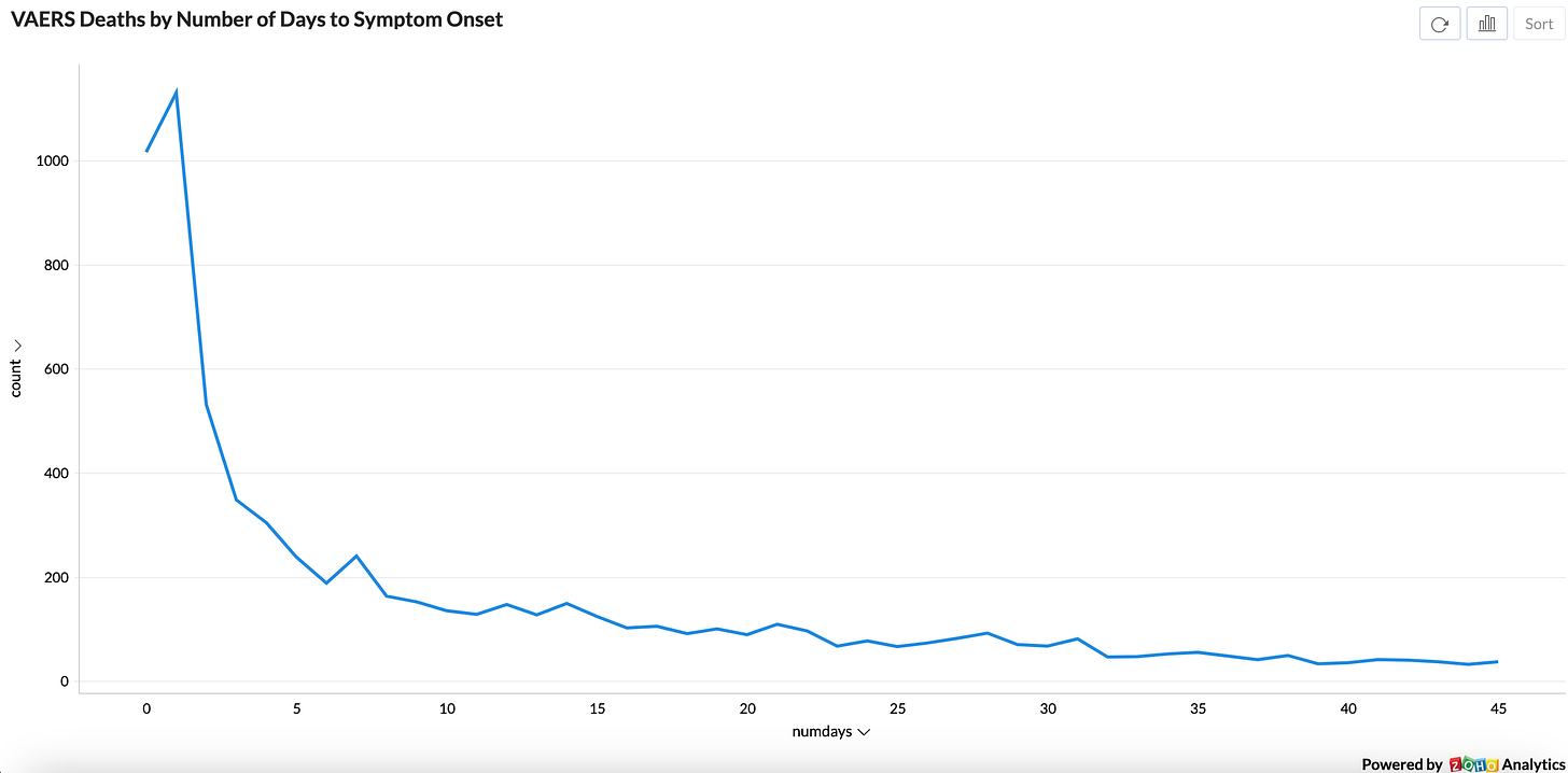
One of the most striking things about deaths post-vaccine is that a large percentage have symptom onset inside 48 hours of vaccination, and they do not taper off gradually (which is what a background rate of death would forecast) but steeply plummet between the 3-7 day mark.
You see the same “pull forward” effect in the foreign VAERS reports too (I omitted New Zealand’s data so it does not affect what I am writing in the next paragraph)
It is as if the “quota of possible deaths” predicted by the background rate got pulled forward close to the date of vaccination and created a temporal effect.
The 21 day window is not internally consistent
I am aware of some studies which show, based on a multi-week time window, that the deaths post vaccination are within the range of the expected background rate.
The best example is New Zealand’s vaccine safety studies.
As you can see, they choose a 21 day window post 1st vaccine dose, estimate the background rate of deaths for each age group, and show that the observed number is no greater than (in fact quite often less than) the expected number for all age groups.
I have a few issues with this.
One, the farther away an event from the date of vaccination, the less likely it is to be due to the vaccine. This means the farther you push out this window, the more easier it is to get your numbers to fall within the background rate.
Two, for an analysis like this to be internally consistent, they should be able to produce the same results even if they choose smaller time windows, such as 7 days and 14 days. The “pull forward effect” suggests that the background rate test will fail if they do this (but I would love to be proven wrong - is the New Zealand government willing to publish these numbers?)
Three, the total number of deaths for the age-wise cohorts do not have a “cause of death” breakdown (and the Excel file they cite for these numbers is not available for download either). Given deaths post vaccination are obviously health related, without access to the death rates for younger cohorts (0-29) specifically for health conditions, the numbers provided in the analysis are raising doubts. Especially when you consider that the groups 10-19 and 20-29 are not very likely to die from health issues, but are also the groups where the observed deaths are very close to the expected deaths, and are also the groups at highest risk for myocarditis1.
Summary
I am not convinced about the “background rate of death” explanation. But I am now quite sure that very few governments are willing to release all the data in a transparent fashion so we can verify their calculations.
Some people suggest that these groups are not at any higher risk for myocarditis than all other age groups, but rather it is easiest to observe serious health conditions in these age groups because they are usually very healthy.


